
Early May, Netflix released an updated logo. The changes are so subtle, even regular users may have to Google what the previous one looked like. The new design keeps the same color scheme but reverses the treatment. The red background and white 3-D text is replaced with flat red text on an off-white background (though of course the colors change depending on what environment they’re implemented on). The typography retains the same curved appearance but opts for a a shorter and fatter typeface. The extrusion element is lost entirely. Thus, to adapt to this change the kerning between letters is reduced.
According to websites such as CNN and Fast Code Design, representatives for Netflix refuse to comment on the change. There is no mention of the change on any social media page or even a press release. The logo change is treated as nonchalantly as it looks.
This flat design is in trend with many logo redesigns. Its approach is an attempt on minimalism. The Helvetica-esque typeface disregards the personality of Netflix. The company doesn’t need to be a wayfinding system; its users want it to be fun. Cinema is a form of entertainment that contains boundless levels of energy. The old logotype was reminiscent of the old Blockbuster signs—which was incredibly appropriate considering the service the company provides. The new approach is not only sterile, but it appears to have no rhyme or reason behind it.
Design without reason (or no good reason at least) tends to backfire, as history shows us. Remember in late 2010 when Gap redesigned their logo? It was the word Gap written in Helvetica with the blue square offset to the top right corner. There was a wave of negative reactions because of how “plain” it was. Here’s where there’s a gap in design thinking. There appears to be the common misconception that hyper-minimalism is synonymous with good design. Yes, it’s clean. Yes, white space is beautiful. However, it’s not an issue of minimalism; it’s an issue of having nothing to communicate. A brand name means nothing without the lifestyle behind it. Design should be appropriate to the experience whether in publication, interfaces, packaging, environmental graphics or the web.
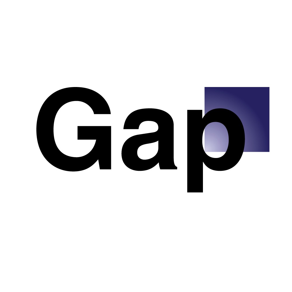
Gap’s 2010 logo wasn’t well received.
There’s a very fine line between being trendy and being innovative. As aesthetic values rapidly change and as designers are given higher salaries in companies, there’s a continuous push toward updating a group’s visual language. In 2013 alone, American Airlines, VH1, Spotify, the Brooklyn Public Library, Facebook, Github, Instagram, Yahoo and Google all gave their corporate identities facelifts. Unsurprisingly, there were varying degrees of success—but the overarching theme was a flat design style. Gradients, drop shadows, and most illustrations are eliminated. Most were reduced to an average of 2 colors and sans serif bold typography. The advantage of this formula is the guarantee that when reduced and reprinted, it translates very well.
However, just like Netflix, all personality is lost. Style-wise, a plane company could look just like a coffee shop. Our environment everyday becomes a redundant pattern of type on a flat color. It’s as depressing a world as if everything was rendered in Comic Sans and rainbow gradients. If the purpose of the designer is to figure out how best to communicate a message, today’s overused flat, minimal style begs the question: Is there anything anyone wants to say?