

The best moments in our lives can be shared in 140 characters—at least according to Twitter. Since it was first released in late 2006, Twitter has been a pop culture phenomenon. The limited message length allows a generation of short attention spans flashes of someone’s life as well as the opportunity to show off what they themselves are up to. It was a challenge to advertise something, to link to something and to tell a “you had to have been there” story. Of course there are workarounds, like posting tweets in succession for a long rant or linking social media profiles together to expand on a story, but the premise remained the same: keep it short, sweet and start trends.
On April 8, 2014 the micro-blogging service officially announced the upcoming redesign of users’ profile pages. The company teased a more visual profile that provided features such as tweet filtering and pinning tweets. The new look aims to be more “media forward” by providing a platform to stream videos, a slideshow feature and even emojis. Vine, the 7-second video service owned by Twitter, also introduced a personal messaging feature. Advertisers are given even more opportunities with the new redesign. Not only is there the potential to personally connect with users but new ad formats are now possible, such as click-to-call and email signup capabilities. There’s a definite turn toward e-commerce capabilities.
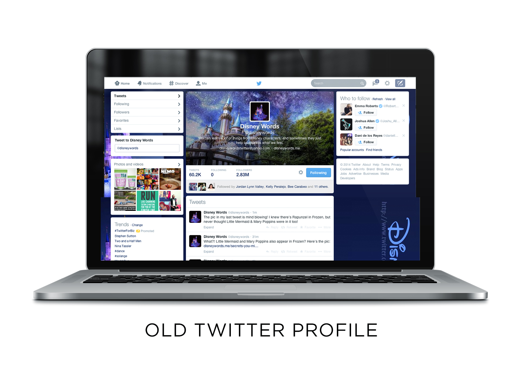
The “old” Twitter profile is very obviously focused on the tweets and what the user has to say.
Since the announcement, the company has slowly rolled out the redesign. Existing users are now given the option to use the new design themselves while new users are given the new design automatically. The new look is so drastically different, comparing the old is a lot like comparing apples and oranges. Though the new design is a lot more visually engaging, the point of Twitter seems to have been lost along the way.
The short blips of life that Twitter provided was something exciting to users. It provided teasers of narratives without bombarding the user with information. Updating one’s profile was quick and reading the profiles of others was a simple scroll. It was challenging to be concise and the original look definitely lent itself well to that. In a sense, it was a perfect balance of staying on the Internet before heading out to live the life you tweet about.
This is becoming less and less possible. The new profile bombards the user with visual stimuli that—though jarring—is arguably hypnotizing. Audiences say it looks like Facebook, a claim that’s hard to deny. The profile photo is enlarged and the hierarchy of information is changed around. It now becomes harder to focus on a person’s tweets because of all the surrounding information. There are two grids of photos on the left hand column (one for your followers and one for your posted photos) and on the right are “Who to follow” suggestions and trends. A lot of this information could easily be removed and instead placed on the homepage rather than a profile. It definitely begs the question of necessity. Just because there’s space, should it be filled?

While the old profile redesigns were written within the same vein (a small profile picture and description at the top) the new one tries to capture the viewer with a large, full-width cover photo.

The Weezer Facebook page looks almost exactly the new Twitter one, save for the blue and white color scheme which Twitter replaces with white and gray.
Depending on what Twitter is used for, this profile definitely has its pros and cons. For companies it’s a great way to flood a page with a brand or product. For celebrities it’s effective in showing off either how “they’re just like us!” or those highly Photoshopped “casual” pictures. On a smaller screen, the information is cluttered and it’s hard to know where to look first. Clever snippets of life are lost to links and images. It’s no longer the micro-blogging service that drew so many fans in the beginning. It’s blogging that hides behind the title social media.
The new features compel one to make post after post after post until there’s nothing left on your news feed except the story of how good that grilled cheese sandwich was for breakfast, complete with pictures, a Vine of grilling it and a link to a Buzzfeed post describing the top ways to make said sandwich. The construction looks great, but the content is simply too much. It’s important to note however that according to the official announcement, the new strategy is to “show the world who you are.”
Viewed in this context the profile is successful, but the question remains whether that’s what the audience wants. If they wanted a play by play, they’d most likely already have Facebook for that. With the amount of competition between different social media sites, the common strategy seems to be emulating the most successful design. Perhaps in a few years Pinterest will look like Tumblr, Instagram will look like Foursquare and everything will look like Facebook. People run the risk of becoming so engrossed with their social media lives that there might not be enough physical engagement to write 140 characters.
Gabby Manotoc has been Creative Director for District for the past three years. She also designs the Port City Review, the student produced and curated annual literary arts journal of SCAD.